


Today I am sharing another card from my Dirty Dozen “How Does Your Garden Grow” gallery. Each month we were asked to select a favorite from the cards that we uploaded, and this was mine. I hope that you like it also! Oh! And for fun, how about a RAK and a rodent, too!
The Stampin’ Schach Design Tips:
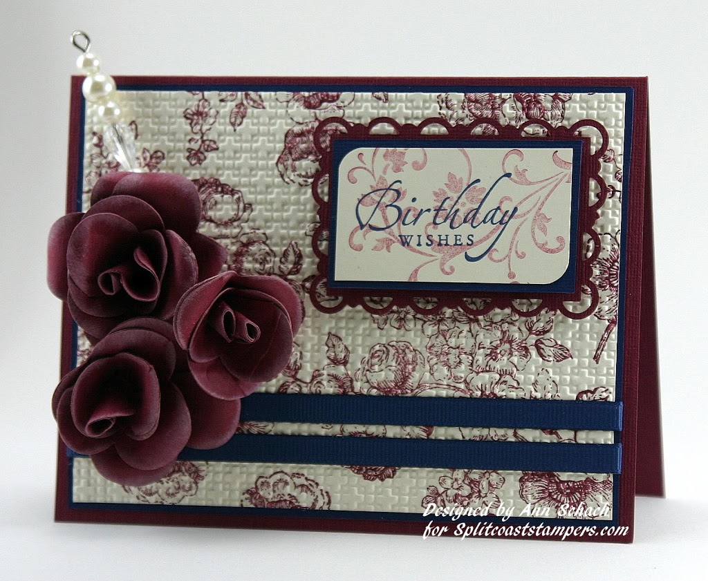
- Faux Toile! The “Floral” image from Elements of Style was randomly stamped in Bravo Burgundy onto Very Vanilla to create the illusion of toile. It was “faux” easy!
- Texture! Try stamping your own Designer Paper and then zipping it through the Big Shot with your favorite embossing folder. For this card I used the Square Lattice Textured Impressions Embossing Folder.
- A rose by any other name! These Bravo Burgundy paper roses look fabulous, and are relatively easy to make using the Fancy Flower punch! The edges were frosted with Very Vanilla ink to add depth. Another option..Smooch Spritz for a little shimmer and glimmer!
Interested in seeing more cards made with these stamp sets? I do have a search option available on my right sidebar!
I do want to share another card with you today, from one of little Miss Muffy the Boxer’s “Puppy Godmothers”, the talented Carla Bazhenow! Carla not only sent a card, but is already spoiling Muffy with new toys! Those of you who are familiar with Boxers know they LOVE their toys…so Godmother Carla is going to be a big hit with her “godpuppy”!

Isn’t this card just too cute? And the inside is typical Carla…just as pretty as the outside. You can see more of Carla’s amazing work at Carla’s Scraps.
And finally, the rodent part of today’s post! I happened to walk past the kitchen window Wednesday morning and did a double take. There, sitting on the head of one of my concrete lawn ornaments, was a ground squirrel. He looked so adorable, that I just had to snap a few pictures. I will apologize for the clarity. It was rainy and overcast, and the pictures were taken through both glass and screen wire. But I think that they will still bring a smile to your face!


I hope that today’s post has brought a smile to your face and has also provided you with a tip or two. As always, I love reading your comments. They are important to me. And of course, if you have any questions about the cards that I create or the techniques that I use, don’t hesitate to email me! Until next time…


Stamp Set: Elements of Style (W 118611; C 120045), Sincere Salutations (115068); Inks: Bravo Burgundy (105214), Night of Navy (102977), Very Vanilla (104308); Card Stock: Very Vanilla (101650), Night of Navy (100867), Bravo Burgundy (105123); Tools: Big Shot (113439), Square Lattice Textured Impressions Embossing Folder (119976), Corner Rounder (119871), Scallop Trim Border Punch (118402), Fancy Flower Punch (118073); Glitz and Glam: 1/4″ Grosgrain Night of Navy Ribbon (109036), Pretties Kit (retired)


