


 It’s Thursday, and as we all know…it’s time to play at Pals Paper Arts! This week we are treated to a sketch designed by Nicole Watt. Chock full of lovely layers, this sketch is just my cup of tea! Enjoy today’s elegant and easy wedding card.
 The Stampin’ Schach Design Tip: Elegant and Easy
This finished card measures 4-1/4″ wide by 5-1/2″ long.
- “Texturiffic”! Nothing beats a layer of lovely texture, unless it is TWO lovely layers. The Spring Flowers Textured Impressions Embossing Folder does the honors on this card.

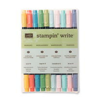
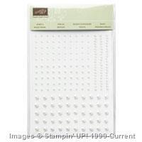
- Pearlicious! The blossoms in the wedding bouquet image were quickly colored using Pink Pirouette, So Saffron, Soft Sky and Wild Wasabi Stampin’ Write Markers. A few pearls were added as the perfect, elegant, accent. I know it may be hard to believe, but I decided to remove a few pearls, and I like the cleaner look. (Gasp! Can you believe I just said that?)

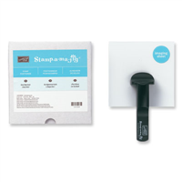
- Sentimental! I always hold my breath when I stamp a sentiment directly onto the card. How about you? But with the help of the Stamp-a-ma-jig, I was able to stamp this sentiment in Soft Suede perfectly…right where I wanted it!


Originally, I was going to use a Whisper White card base with white mats and design a white-on-white card. But I decided a touch of neutral color was needed, and pulled out the Sahara Sand cardstock. I was pleased with the final result. Now I just need a wedding!
 So…what do you think of today’s card? Do you like it better with fewer pearls? And how about stamping the sentiment directly onto the card…am I the only one who holds my breath doing this? (That’s why I use so many banner sentiments!) Won’t you let me know the answers to these questions in today’s comment? Your comments are important to me, and I do read each and everyone! And remember, if you ever have a question about the cards I create or the techniques I use, I am only an email away. Until next time…


Built for Free Using: My Stampin Blog


Love it all Ann! Gorgeous!
Fabulous card!! Very creative!!! I absolutely love it!!
That would be a sketch I could handle and may try to get something made. I love your card. That stamped design is so pretty!
Beautiful! Love the neutral colors. I like the version with less pearls. Stamping directly on a card is scary. I think this can be an anniversary card as well as a wedding card.
Wow, this is so beautiful. But I always think your cards are beautiful! I feel a case coming on. This would be a great card to have on hand for anniversary as well. I always have plans to have cards made in advance….sadly, that doesn’t happen too often! Thanks for sharing your talent.
FABULOUS card! Love everything about it – the embossed layers, your touch of flowers and of course the pearls! Am so in love with Sahara Sand – ink, ribbon, c/s.
I definitely like it with fewer pearls – makes the pearls more special. The neutral SS sets off the elegance without being in your face [other options: gold foil – classy; hot pink – jazzy; black/ grey – sympathy card]. “Stamping directly on the card – This doesn’t seem like you’re stamping “directly” on the card to me since it is the third layer off the base card. Even if you were stamping directly on the base card, you could cover any mistakes with another layer! I admire people who are patient enough to use a stamp-a-ma- jig – the results are gorgeous!! Maybe I’m impatient because I’m always sending things out late!! ; – <
Love this Ann – possibly the best use of this embossing folder I’ve seen. I wasn’t tempted to purchase before, but now …! I prefer the fewer pearls version too – here less is definitely more!
Such beautiful embossed layers Ann! They lend the card such an elegant feel…and fewer pearls are more elegant, too. Stamping the sentiment directly onto the card is nervewracking!!! Glad I am not alone in that department.
Ann, the clean look with the fewer pearls is my preference. Soft and elegant. And YES I am anxious every time I stamp on a card (inside or outside).
Gorgeous and so elegant. I had to read the comments and loved the responses. I am not sure which I like the best but I really do like the pearls on that one flower like a hollyhock or something. Decisions, decisions! I think this would be a great sympathy card too. I have messed up my share of cards with a sentiment goof!
Adorable card Ann! Yours always are, but hey, I didn’t think you used enough pearls this time, so I put some on mine for you.
delicate and beautiful as always.
I too love this card. It will make a perfect sympathy card. Sadly, I need several of those as we speak.
Pearl stock prices just plummeted and oysters everywhere are in rebellion! Who ARE you and what have you done with my Ann! OMG! Is there nothing sacred!?!?!? Oh, btw, gorgeous!
Beautiful! I tried this sketch several times and came up with NOTHING! I don’t know why it was hard for me. You nailed it, Ann!!
Eeeeeek — I would have left the extra pearls — LOL 😉 Beautiful card Ann — you always inspire me !!
gorgeous! Such a simple image turned into such elegance. You’re the best!
What a beauty! I adore the Sahara Sand as I think that it is so rich and really POP color when layering. I could not be without my Stamp-a-mag jig, I am totally with you on that one as stamping that sentiment always makes you hold your breath! Fabulous card….
Oh Ann, what a beauty!!! this glorious bouquet is so gorgeous, the textured layers frame it perfectly. I love that you chose to use Sahara Sand to frame the embossed layers, this really makes the image pop. Now, I personally like the bouquet with all the pearls, but then again, I just love it when you add pearls to your cards.
I too get nervous when I stamp sentiments directly on cards, a few times I’ve messed up a great panel by either my hands tremble a little or I drop the stamp on top of it or it’s all crooked, ughhh!! Then, I just go get that SAM and do it over.
Your card is gorgeous Ann, maybe soon you will be able to give it away to some lucky bride and groom.
Thank you so much for sharing.
i LOVE LOVE this card!!! simple but elegant and love the touches of sahara sand. i’m liking the card with the pearls removed more …