


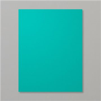
It’s time to play with the Pals at Pals Paper Arts! This week is a color challenge in a trio of blues. Because I still need Christmas cards, I pulled out the Ornamental Pine stamp set. Even though Bermuda Bay does not rank high on my list of frequently used colors, and despite the fact it is certainly not a traditional Christmas color, I am delightfully surprised at how this card turned out. And as an added plus, it’s quick and easy! Enjoy!

The Stampin’ Schach Design Tips
This finished card measures 4-1/4″ wide by 5-1/2″ long.
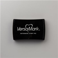
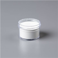
- Do as I say, and not as I do! The Ornamental Pine stamp was inked in VersaMark and stamped onto Bermuda Bay cardstock. It was then heat embossed with White Stampin’ Emboss Powder. Tip: Use an Embossing Buddy to cut down on stray speckles! I didn’t, but I wish I would have! Luckily I stamped Gorgeous Grunge “snow”, so the speckles do blend in a little.

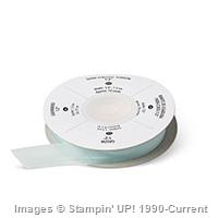
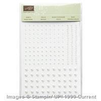
- “Pop” up the cone! A second pinecone was stamped, embossed and snipped out. “Popping” it up on a dimensional adds depth. A simple little Soft Sky Seam Binding bow and a single pearl set it off.

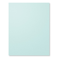
- Double the JOY! The Joy framelit from the Wonderful Wreath collection was cut out of Soft Sky and Whisper White cardstock. They were layered Whisper White over Soft Sky. The result makes a striking sentiment.

Although Bermuda Bay was a fun color to use, I am excited to make a few more of these in different colors. I think Cherry Cobbler would be quite striking. I can’t wait to try it. What about you? What colors do you think might be good choices to use? Won’t you let me know in your comment today? Your comments are important to me and I always look forward to reading them. And remember, if you have any questions about the cards I make or the techniques I use, I am only an email away. Until next time…


I am always excited to see your creations…and you very rarely disappoint me! The colors are fabulous with this set and can easily imagine Cherry Cobbler and even the Blackberry Bluss…have seen greens but am really liking the non traditional colors this year!
Test
I have seen this set in a lot of colors on the web. Aside from traditional colors, I like the softer blues with a snowy effect.
Ann love this card and the blues are fabulous. I really like to stack 4 to 5 layers of the WORDs die cuts… I use different colors to give it depth and interest. Your “JOY” looks wonderful! Hugs
Beautiful Ann….. the light Ornamental Pine is beautiful against the Bermuda Bay background.
Ann, I just love the colors on your card and the embossing is amazing. I think Cherry Cobbler would look fabulous, it’s such a rich color that the white embossing would really pop. I’m partial to Blackberry Bliss, so that is another fantastic combination for you. I wouldn’t spotted the little specks of embossing powder if you wouldn’t have pointed it out, Gorgeous Grunge was a perfect way to hide them though, great job, LOVELY CARD!!!!!
Beautiful card. I love the colors.
Lovely lovely card, Ann.
Beautiful Ann! I love this set and will hate to see it retire!