


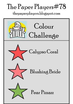
It’s Sunday and time to play with The Paper Players. This week the lovely LeAnne selected a trio of colors for our first color challenge of the year…and what a challenge it was for me: Calypso Coral, Blushing Bride and Pear Pizzazz…three colors which I rarely use. However, armed with a Splitcoast sketch (SC209), I enjoyed designing this feminine thank-you card. I hope you will join us at The Paper Players this week! We can’t wait to see what you create!
The Stampin’ Schach Design Tips: A Feminine Thank You
This card measures 5-1/2″ wide by 4-1/4″ long.
- Lovely Layers! One way to add depth to a card is through layering. But look for patterns that balance and coordinate, such as these small patterns from the Twitterpated and Everyday Enchantment Designer Series Paper collections.

- Feminine Touches! Placing the Corset image from Rue Des Fleurs in the Oval Designer Frame mimics the look of a brooch. A triple bow created from Calypso Coral Organdy Ribbon, a Sale-A-Bration item, enhances the delicate look!

- Pearl and Pear Pizzazz! A Pear Pizzazz Labels Framelit takes on even more pizzazz with the addition of Basic Pearls, providing the pearl-fect anchor for the Oval Designer Frame!

- Snip-a-V Doo Dah! A free-hand snipped “V” adds interest to the sentiment, breaking up the straight lines associated with the various layers.

- Complete with pleats! Nothing beats the new 3/8″ Pleated Satin Ribbon. It is so versatile…as you will see in my upcoming cards! The Pear Pizzazz hue adds a lovely “pop” of color when layered upon the Calypso Coral paper.

In yesterday’s post, I tempted you with a peak at how this card would look with green pearls. Here is the complete picture:

It’s not bad…but I carefully removed those green pearls, which I had colored with a permanent marker, and added Pearls Au Naturale in their places. I felt they coordinated better with the natural pearls on the corset, making the card more cohesive.
After a well-earned vacation of a few months, little Muffy Lin (UKC Grand Champion Cimarron’s Do You Know the Muffin Man) entered the show ring again in Melrose Park, IL Saturday. Not only did she win Best of Breed, the little squirt took first in her Group, and competed for Best in Show. She was thrilled to be strutting her stuff for the judges again. Brother Brody still has two weeks to wait before he begins the 2012 season.
I hope you enjoyed today’s card. I would be interested in knowing your thoughts about the green pearls. Please let me know what you think in today’s comment. And remember, if you ever have any questions about the cards that I create or the techniques that I use, I am only an email away! Until next time…


Stamp Set: Rue Des Fleur (W 125485, C 125487); Inks: Soft Suede (115657); Stampin’ Write Markers: Blushing Bride and Pear Pizzazz (119801 2010-2012 In-Color Set), Calypso Coral (123002 2011-2013 In-Color Set), Sahara Sand (105105), Soft Suede (120973); Designer Series Paper: Twitterpated (125406-Occasions Mini), Everyday Enchantment (126154-SAB); Card Stock: Calypso Coral (122925), Blushing Bride (119796), Very Vanilla (101650); Tools: Big Shot (113439), Extra Large Oval Punch (119859), Designer Frames Textured Impressions Embossing Folder (123130), Labels Framelits Collection (125598), Color Spritzer Tool (107066), Sponge Dauber (102892), Paper Snips (103579); Glitz and Glam: Basic Pearls (119247), Calypso Coral 1/8″ Organdy Ribbon from the Everyday Enchantment Ribbon and Brad Pack (127279-SAB), Pear Pizzazz 3/8″ Pleated Satin Ribbon (125568-Occasions Mini)


I am following you now. I found you via stampin connection.
I love this card. It is really beautiful.
LOOOOVE this card!! It’s absolutely BEAUTIFUL!! And I prefer the white pearls! Way to go, Muffy!!
Hi Ann. I love this – I like your choice for the vase. Just beautiful. Now you have to be rainbow pearly Ann. The papers are really nice…they look like they are textured! xox
Definitely not the green pearls. White pearls are more subtle. Also instead of the calypso coral organdy ribbon, why not try the lucky limeade organdy ribbon.
Absolutely stunning! While I still think the green pearls add an aire of interest, I do feel that the eau-de-naturale pearls add that vintage look that is in keeping with the theme of this card.
Beautiful card! Just love it! Love the color combo. Glad to hear about Muffy too! She’s amazing!
I knew I wouldn’t be disappointed! This card is so girly…I love it! Also love all the colors and texture!! Fantastic job.
Gorgeous card. I truly love both versions, though surprisingly, upon seeing the full card, I prefer the natural pearls. When I saw the peek I prefered the green. The natural pops more in the context of the whole card.
well Ann for not using these colors often you certainly turned out one beautiful card-love the image and the frame you placed it in as well as the gorgeous pleated ribbon-I like the natural pearls-I think they comlement the card very well-also a big congrats to Muffy
I am amazed at the number of comments, LOL!! Obviously, I am not the only one who loves your take on the colors! What a lovely thank-you; I particularly like the little ribbon
peeking out!
As you are the “pearl-master” I absolutely love how you did the card two ways. Both are beautiful, although I have to say I kind of like the pearls “in the buff”! Hee hee, who knew stamping could be so racy! Absolutely gorgeous, Ann! Just when I didn’t think I wanted that set, too. Eeek!
Big congrats to the Muff-ster! She’s back rocking the ring! Woot Woot! Hey, guess what? I get to see you in a few days! How exciting is that?? Make sure you pack your cowboy hat! 🙂
I think you made the best choice going with the natural pearls! It’s a beautiful card!!
Gorgeous, Ann! And I think you carried off the color challenge with aplomb! And I agree, I think Au Naturel pearls were the way to go as well.
Big congrats to Muffy on her huge win! I’m sure Brody’s rarin’ to get back in the ring and show his stuff as well so he can catch up to his sis!
I liked the green pearls at first, but after seeing the entire card, I agree that the white pearls go better with the overall look of the card and match the bustier pearls.
I like the white pearls as they show up better. Great dog showing. Card is so beautiful.
Thanks
Very pretty card. I would never think of combing these colors, but your card looks perfect. TFS
Congrats to Muffy for the win.
SUCH a gorgeous card Ann! The bright colours are toned down and tamed in a good way! I love the green pearls! Congrats to Muffy!
Hugs,
Lesley
Gorgeous Card. I like the layering and colors and do still prefer the white pearls.
Wonderful card Ann ~ I still LOVE the green pearls, but I definitely agree that the au natural looks nicer along side the pearls on the corset ~ TFS your fabulous creativity with us…I would love to have a weekend of creativity with all the members of the Paper Player…one of my favourite sites! Enjoy your day *hugs*
Ann, your card is certainly feminine. I love the corset image in the oval frame, and it fits so well with your vintage look. IMHO, I like the au natural pearls on the card for exactly the same reason as you.
Beautiful card! I think I still prefer the natural pearls best but I like the green pearls more than I did in the tease yesterday. Thanks for showing us both versions!
Inky hugs,
janet
You amaze me, once again!! I like it either way with the pearls natural or green. This is an absolutely gorgeous card!
Pretty color combination and the layout is really neat! You made a great card!
White all the way–I was trying to reserve judgement till I saw both cards, but believe the white is just the right choice. Congrats to Muffy and her proud mommy! D
ANother stunning card–and I just love the pearls!!
Gorgeous card! The image in the frame, the layers, the pleated ribbon–love it all! I still vote for the au naturelle perles.
Congratulations to Muffy!
Yes, I definitely like the white pearls better on this card. I think the green ones are cool but might be better on a modern looking card. Congrats to Muffy!
Ann what a lovely famanine card. I just made a Bday card using this set. LOVE it. I really like how you put it in the oval. The layering is gorgeous, love the flagged end on the sentiment too. I am sticking with my “white pearls” vote now that I see it again. although I love to color them, on this card I think it’s more fem with the white. As for Muffy congrats on all those wins too.
Hugs
Congrats to Muffy Lin!!!!!
Now that I’ve seen the WHOLE card, I’ve changed my mind and prefer the white pearls.
TWO. MORE. SLEEPS.
Ann while I enjoy pearls of all colors, the “natural” ones were a better choice on this card due to the sheer volume of them and the bacground they were on. debra
Beautiful card Ann, it looks like the flowers are 3d. Beautiful job as always. ALSO CONGRATS to Muffy,I would strut too ! LOL!!
Susan B.
Love the corset in the frame – it does indeed look like a brooch. Personally, I prefer the natural pearls rather than the green pearls. Great card! Congrats to Muffy!
Love what you did with the colors. You created a real girly girl card. And I still do prefer the natural pearls. Congrats to Muffy. Looking forward to hearing about her latest triumph in a future post.
Love this – you rocked that sketch and the use of these “un-used” colors. I prefer natural pearls~
Love the natural pearls! Cute card! And congrats to Miss Muffy!
I agree, green pearls are fun, but the switch was more cohesive. So cute. And congrat’s to Muffy!
Very pretty – love that pearly frame! So glad to hear that Muffy Lin is strutting her stuff in fine form again! She is a champion – like her mom 🙂
I liked the natural color pearl on the sneek peek and after seeing the full card I REALLY like the natural! Great job!
What a beautiful card! I do like the white pearls better than the green. Love all the layers, too.
I really love this card, Ann! I would like to know how you adhere cardstock to the pleated ribbon and make it look so nice. Do you use dimensionals for the other end of the cardstock? I like the white pearls but can’t wait to see what you end up using the green ones for!
Congrats to Muffy!
Thank you for your help!
Debbie M.
(mageed1@sbcglobal.net)
I have to say I really like the white pearls the best with this style of card. The card is fabulous. You are so talented. Congratulations on Muffie’s win.
Love all of the neat layering and pearls. The au natural pearls say it best. Congrats to Muffy. Kathy in AZ
What a great card. Love the colors and the layout! You did a fabulous job as usual. The pearls add so much and the oval is just perfect for this stamp.
Congratulations to Muffy! I imagine she is strutting her stuff to her brother!
Hugs to both.
Removing the green pearls is the right decision, I like the natural color more (too). What a beautiful color combo, it’s so spring!
Lovely card Ann, I agree with you the green pearls looked nice, but I’m a “matchy-matchy” person so I love the white pearls to match the ones on the corset. Speaking of the corset don’t ya love the flowers popping out of the top, so girly!
I love these colors together! What a pretty card! And I love how you used the oval frame to create the look of a brooch, so feminine and vintage! I originally picked the green pearls but I think now after seeing the full card that I like the natural ones better, even though the green ones are still pretty. You have such a knack for pulling everything together!
Congratulations to Miss Muffy, I know you are so proud of her! She is such a pretty girl!
Ok, I must admit,when I’m worong, I’m wrong.
Yesterday I said green but changed my mind and gotta say the white pearls do look much better. Hey, it’s a woman’s right to change their mind. :}
Awesome! Chocolate stamp set giveaway and no calories. :}
Oh, beautiful looking card by the way.
Congratulations to you Muffy. Brody, it will be Your day someday. Just be patient.
ColleenB.
These colors were definately outside my comfort zone too but you’ve made a beautiful card with them…love all the layering and the layout is fabulous! I love the au naturel pearls..so perfect on the corset image. Big puppy hugs to Muffy!
Hi Ann! Love your feminine card! The shaped layers are great and that pleated ribbon looks so pretty. I like the shading you added to the focal point too. I need to remember to do that!
So glad to hear Muffy’s good news! I’m sure she was strutting her stuff for the judges. She is such a beauty!
Beautiful, Ann! I love colored pearls, but on this card I think I prefer them natural. Even though this stamp set is not one of my favorites, you have made a wonderful card with it. Love all the layers and I love this color combo. Thanks!
So much to love in this card…the layering is fantastic, the framing of the image is wonderful, and the sentiment is beautifully done. The peek of pleated ribbon below the layers is charming. I like both the green and the white pearls, but probably lean more toward the white. The only thing I would change is the color of the bow…somehow it doesn’t work for me, but it probably looks different in person. I wonder how it would look in white?
Ann, this is so beautiful! I love the stamped image with the pearls down the front, and the layout is just great.
Lovely card! I like the green pearls to add a little color to the card. i think everyone has orded that paper but ME!
Woohoo and high paws to Muffy!!!
Fascinating! The finished card made me “forget” the colors! And I still prefer the natural pearls. Congrats to you and Muffy.
I hope to one day meet you in person. Your cards a absolutely gorgeous.