


The Stampin’ Schach Design Tips: Random Stamping
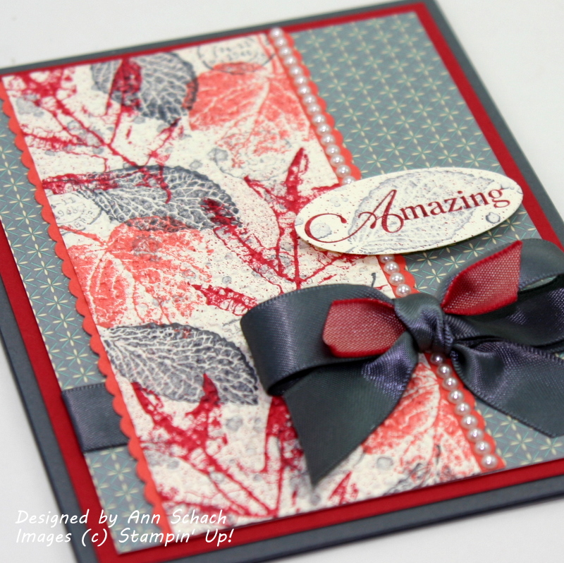
- Random stamping! The three varieties of leaves from the French Foliage set were inked in the three challenge colors and randomly stamped onto a Very Vanilla panel. I also inked up the Postmark and Waterspot stamps in Basic Gray and added them to the mix. Hint: Start with a panel which is larger than what you will need. This way, when you trim it to size, some of your images will be stamped off the edges. It looks more “natural” than trying to position your images off the edge. Stamp your largest image first, then fill in with your smaller images.

- An “amazing” sentiment! I selectively inked the Amazing sentiment from Floral Fillers using a Riding Hood Red Stampin’ Write Marker. The leaf was inked in Basic Gray, as was the Waterspot stamp, and was stamped off before stamping onto the sentiment oval. A few little speckles, courtesy of the Color Spritzer Tool, and the look is…amazing!

- Bow magic! A snippet of Riding Hood Red Taffeta Ribbon sets off the Basic Gray Bow. Need a refresher on making the perfect bow? Click HERE for my Video Tutorial.

- The “pearl-fect” finishing touch! A “string” of pearls highlights the right side of the image panel.

Unconventional colors for fall, but I think they work. What do you think? Let me know in today’s comment. And if you have any questions about the cards that I make or the techniques that I use, please do not hesitate to email me. Until next time…

 Stamp Sets: French Foliage (W 120845, C 121166), French Foliage (W 122780, C 122782); Inks: Basic Gray (109120), Calypso Coral (122939), Riding Hood Red (111836), Riding Hood Red Stampin’ Write Marker (120971); Designer Series Paper: Domestic Goddess (122355); Card Stock: Basic Gray (121044), Very Vanilla (101650), Riding Hood Red (111348), Calypso Coral (122925); Tools: Big Shot (113439), Square Lattice Textured Impressions Embossing Folder (119976), Large Oval Punch (119855), Dotted Scallop Ribbon Border Punch (119275), Color Spritzer Tool (107066); Glitz and Glam: Basic Pearls (119247), Basic Gray 5/8″ Satin Ribbon (124326), Riding Hood Red 3/8″ Taffeta Ribbon (122988)


Beautiful card. I love the embossing.
Love this card – will be doing a demo for Demo’s using My Digital Studio later this month. Would you mind if I CASE’d this card for my presentation?
You’re right….simply A.MAZ.ING!
ove the random stamping and the embossing!! A great color combo too!
Such unusual colors to put together but I love it! Love the pearl detail too…beautiful!
{sMILES}
The texture, the bow and the pearls make for a GORgeous card! Woo Hoo!!!
that is so great.
Oh my WOW!!! This is just STUNNING!!! And as soon as I get home from my mini getaway with DH I’ll be CASEing it! Thanks for another AWESOME design!
I agree, not your typical fall colors, but I love it. Great job.
TFS
What a great card! I would not have thought of the color combo either, but it really does work. Thanks for the tips on making our own “dsp” look paper. Will use your tips next time. I have a huge wish list from the holiday. Just what I need to add to my regular catalog list.
You featured these colors beautifully, Ann!
I agree, not your typical colors for fall and at first I thought, naw, I’ll pass on this color challenge but I changed my mind! These colors do work well…….I hardly ever use the Basic Gray! You used one of my favorite all time stamp sets and I love what you did with it. Love the little snippet of ribbon inside the other!
Ann, this is, without a doubt – my absolute all time favorite Stampin Shach card! Stunning!
Hugs
Jaydee
I reallllly like it! Thanks for the tip about stamping off the page…I find that hard to achieve, but now I’ll just start with a larger panel. Brilliant! So, you textured after stamping, right? Super card! Your amazing son will love this amazing card from his amazing mom!
Wow, I really love this card! I don’t like the colors on the runway models but on your card it works! I use a lot of red and gray together and have used rust and gray but that one color – not sure about. I love all the texture and that bow is amazing. Love the strip of pearls too. Fantastic job, as usual. Now, I am curious to see what others did with those colors! Hugs to Brody and good luck to Muffy this weekend. Hope the patient is home and already on the mend!
Chris R. from Iowa
Those colors really work well. Very vintage and Fall like. And those pearls, omg, how do you get them so STRAIGHT??? Perfectly aligned with the Stampin’ Schach touch, of course!!!!
You weren’t joking when you stamped AMAZING!!! This is beautiful Ann!
This is definitely a color combo I would not have thought of. You did an ‘amazing’ job with this card. I especially like the sentiment stamped over the leaf and the bow.
Wow! I’m in love with your card. I love the colors and the desigm is beautiful.
I’m a little stumped on these colors! But your card turned out lovely, as usual! I love the pearls. It’s just the right touch!
Ann, this is amazing! I love the color combo, and anything stamped with French Foliage is usually smashing! I love that set and am so happy they put it in the catalog.
Amazing and pretty too! *smile* Hugs,
This card is striking! Wow. So elegant and cool. Cool as in makes me think of a foggy fall morning.
I keep forgetting to use the Square Lattice on DSP. This is a beautiful effect!
Mike
Ann, this is so beautiful. Love how you combined the colors together and used the embossing folder along with all of the details and pearls. Love it!!
Ann, your card is “amazing” even if these are not the typical fall colours. I like your tip on stamping on a larger piece of card stock and then trimming to the size you want. I hope that Brody is doing better and that his sutures will finally heal. Have a great day.
I just checked the PPA challenge and thought…………wow this is a tough color combo. But you nailed it Ann. Your card is gorgeous I absoutey love the way that you combined the colors. Thanks for the inspiration. 🙂
Mary
You’re sentiment says it all – AMAZING!
Absolutely gorgeous, Ann.
Hugs, M
Love it, Ann!!! Like you, I never thought of those three colors together but boy do they work! You card is beautiful as always. You always are a great inspiration to all of us-thank you!!! Kathy in AZ
Amazin how these colors came together. It’s a real treat to see the two colors of ribbon in the bow.
“Amazing” card, Ann! Very nicely done and love that row of pearls!
Amazing card, Ann! I love that bow, Ms. Bow & Spritzer Queen! You worked these colors together very well!
Because of you and your awesome cards, I ordered a spritzer … should come in tomorrow! WooHoo …
Ann OH MY GOSH! THIS is GORGEOUS! I would never have grabbed those colors but WOW…it looks amazing! I just love French Foilage and think I’ll never stop using it, but you’ve put a whole new spin on it with these colors, and I thought I’d tried them all. So cool. I LOVE your bow with the snippet of red, and the gray/red sentiment is fabulous. The pearls…. well you know me and pearls. Hugs.
WOW!!!! This IS amazing!!! I love the colors!! When I first heard of the colors I was thinking….I don’t know if those colors will work together….but you showed that they can work together AND be beautiful!! Great job!
Love how you tucked that bit of red in the bow! That little bit makes such an impact!
It really does work Ann! I also like the way you stamped the sentiment on a leaf.
oops forgot to sign my name on the post I did. still is awesome card will try & make one simular today. Jan
Ann, I knew your card would be awesome & it is. Thanks so much for your inspirations.
Oh! beautiful Fall card. I would never have put those colors together but they worked great.
beautifully done ann-you worked the challenge colors so well-love the ribbon treatment-the touch of riding hood red really sets it off
Oooooo! This is completely cool! I love the odd color combinations and that bow is to die for gorgeous! I think the bow and the pearls tie it all together perfectly.
One word describes this beautiful card….AMAZING!
Beautiful!
Hmmm, I’m not liking that color combo, even if it came from the Color Coach! Great job, though, pulling them together into a ‘whispery’ look.
Beautiful French Foliage card!!!! Love this set and am glad the fall season is upon us. Can’t wait for your other creations! ;D
Iconic! Uncovntional! Beautiful!
I knew I would love this card. The colors are great. Really a fabulous card. I love this stamp set.
This came out gorgeous! I would not have thought to put those together either, but yeah, it really works! Very elegant, way to go!
Yup, your title says it al, Ann! This is absolutely gorgeous! The color combo looks so fresh and fabulous for fall, especially with all of your “Schach-tastic” touches. Wow, wow, WOW!! I love it! 🙂
Beautiful and classy! Love it!
I love your card, everything about it is perfect.
Amazing is right!!!! It’s amazing how beautiful these colors work together. I am loving that bow with the little snippet and the sentiment with the leaf stamped in the background. You are so inspiring… Great job.
hugs
Darlene-Joy
BEAUTIFUL! this color combo is unusual but you sure made it work! Awesome card! LOVE the bow!!!
You are right I would never have chosen those 3 colors together, but they look amazing! Beautiful thinking about fall card.
Very very very pretty! I initially purchased this stamp set for the watermarks but since have fallen in love with all the stamps. Love your color combo. It’s fun to be surprised when colors you would never dream of putting together, go together. Beautifully done, Ann!
Wow This is awesome! I LOVE these colors together! Definitely an “amazing” card! I wasn’t sure I wanted this set but as usual you have convinced me that I need it! I will be casing this for sure!
Hope Brody’s surgery went well and he is on his way to a complete recovery!
Your sentiment on this card says it all…..AMAZING!
“Amazing” says it all! You made this challenge look so easy, and I had such a difficult putting these colors together. Your card is really, really gorgeous! TFS.
I knew I would love that stamp set! Another beautiful card,Ann!
Wow! You have outdone even yourself! This is fabulous, awesome, gorgeous!
Your card is beautiful. What a wonderful talent you have. Judy W
Wow… Amazing! I never would have put those colors together either! I love the idea of trying them as fall colors for that stamp set so I just might have to CASE this one 🙂
What a yummy looking card! I would have NEVER put those colors together, but they totally work they way you’ve used them! BRAVO!!
And I’m totally stealing your pretty bow idea. Fair warning, lol!!!
Pretty card and them colors really work together nicely.
ColleenB.
Oh my gosh …this is beautiful. No way would I have used those colors together until now. Love the pearls and bow for finishing touches!
You are right Ann. Not your typical fall colors but it works. A very classy, elegant card. I was surprised I liked those colors together. Nicely done, as usual.
Babe