


(Today’s card is: 5-1/2″ wide x 4-1/4″ high.)
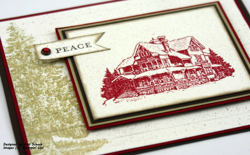
- Select the correct image! Obviously with a name like Christmas Lodge, this stamp set is perfect for creating a rustic card. Not only did I use the Lodge image, but the Evergreen image stamped on the back layer also adds a rugged, rustic feel!

- Select the correct colors! Warm, rich colors are often the correct choice for rugged cards. Early Espresso paired with Cherry Cobbler works well for matting, while Very Vanilla (or Naturals Ivory) is the perfect paper on which to stamp. Adding a narrow mat of Brushed Gold adds instant elegance.
- Select the correct texture! The new Stripes Textured Impressions Embossing Folder recreates the look of refined boards…elegant and thematic.

- Select the correct sentiment! A cursive sentiment adds elegance, while block lettering looks more rugged. I selected block lettering, and used just the “Peace” from the “Peace on Earth” sentiment from the Comfort and Joy set. The Pearl was colored using a permanent marker and set into a Brad from Vintage Trinkets.

- Emboss! The Lodge image was embossed using Cherry Cobbler Stampin’ Emboss Powder, while the Evergreen was inked with River Rock Craft Ink and embossed with Clear Stampin’ Emboss Powder.

I hope you enjoyed today’s card. I thought if I could do it over, I would remove the “Peace” sentiment and add Pearls…so I did just that. But now, I don’t know if I really like it. I think maybe I should have colored the Pearls. Which version do you like the best…Pearls or Peace? Let me know in today’s comment.

I asked Brody for his opinion, but he was too busy helping me unpack my latest Stampin’ Up order. Removing the packing paper is his favorite part!

As always, your comments are important to me, and I do read each and every one of them. And don’t forget, I love answering your questions about the cards that I create or the techniques that I use. Remember, I am as close as your keyboard…just email me! Until next time…

 Stamp Sets: Christmas Lodge (W 123767, C 123769….Holiday Mini), Comfort and Joy (W 124175, C 120753…Holiday Mini); Ink: Soft Suede (115657), River Rock Craft (119719…Craft Stampin’ Spot), VersaMark (102283), Soft Suede Stampin’ Write Marker (120973); Card Stock: Very Vanilla (101650), Early Espresso (119686), Brushed Gold (102935), Cherry Cobbler (119685); Tools: Heat Tool (100005), Big Shot (113439), Stripes Textured Impressions Embossing Folder (123128), Cherry Cobbler Stampin’ Emboss Powder (122949), Clear Stampin’ Emboss Powder (109130), Sponge Dauber (102892), Color Spritzer Tool (107066); Glitz and Glam: Basic Pearls (119247), Vintage Trinkets (118764)


What a beautiful, rustic card, Ann!!! I choose the pearls.
Love the color combo! Kathy in AZ
Lovely in both versions, but maybe ‘peace’ is the winner … hm so hard to pick, they are both gorgeous.
beautiful! love the speckled paper, and the tree on the edge.
Another of your gorgeous cards Ann! Love that stamp and the way you have the embossed stripes across the background with that beautiful tree!
I like the card with the Peace wording. The little bit of gold sets it all off so nicely!
Gorgeous!
Sigh – Brody is such an artist – sigh! Isn’t he cute?! Woof, woof.
Ann- this is beautiful. Do you mind if I “case” your card? I’m just beginning to think about Christmas cards and this would be perfect. Love Brody and the packing paper.
Julie (jlvrsls@sbcglobal.net)
Another lovely card! I really like the tree on the base mat along with the new embossing folder. Beautiful!
this is a beautiful cas card card Ann-love both versions but my fave is the one with the peace sentiment. The lodge looks like such a serene place so I thought you chose the perfect sentiment
Hi Ann: This is beautiful! The tree in the background…Brilliant! The peace sign (love the distressing and how that vintages the tree) is such a fantastic way to tie in the tree with the home. You did a lovely job on the home as well. Great color for it…see, who would think of that but pearly Ann! You know, The horizontal impression folder is perfect…it makes me think I could just walk along anywhere within your image (along the lines of the folder) and be right in with the vintage scene. I love this!
Based on the number of comments, I am not alone is loving this card! Well done!! And I vote for the “Peace” version…
I love the simple sentiment on this one, Ann.
Hugs, M
Love love love how you used this set! Very serene…perfect Christmas card. Oh..and the pic of Brody is priceless! I can so imagine the bits of paper you’ll be picking up! 🙂
{SMILES}
so elegant, Ann! The sentiment and the design are a perfect match. I love the simplicity of this card, and the depth you added by placing the tree image behind the focal. Genius!
Love the rustic feel of this one. The evergreen is so pretty with the lodge stamp. I like the version with the peace tag the best. Think with the rustic look, metal brads would be compliment the rustic feel more than the pearls.
Gorgeous card!! I love the design and each and every element!
Both are great but I think I like the “Peace” sentiment the best. The whole scene is peaceful looking. Plus, I love the colored pearl set in the whatever it was called. But, that is just my opinion. I really like the tree the way you did it. Great job as usual!
Does Brody shred it or just play with the packing? So far, Henry has ignored it but one of these days I am sure he will attack some that I have saved just in case I need some come Christmas time.
Chris R. from Iowa
Ann, it is WAY too hard to choose. Maybe the stress drove Brody to “help” you unpack instead of choosing!!
I love both of the cards!
Peace!!
I like the Peace banner the best, partly because it adds some color, so if you were to color the pearls, I’d like them both. I also love the evergreen tree in the background with the Stripes EF adding texture. A beautiful card!
I like the Peace banner the best, partly because it adds some color, so if you were to color the pearls, I’d like them both. I also love the evergreen tree in the background with the Stripes EF adding texture. A beautiful card!
Oh WOW! I just ordered this set and this card will be the first one I CASE! AWESOME work as always!
I think the PEACE card was my personal fav.
Ann – Neat card and ideas for sure. Regarding your quest for opinions on the pearls, I think the positioning of the pearls is good, and would suggest using the antique brads. Also, you might do a really light dusting of the tobacco (#10174O Smooch Spritz.
Jan
I liked the one with sentiment & the pearl colored in red….
Great card~!
This is the best design I’ve seen yet using this set: I love the tree as background to the lodge. Simple and beautiful. And I definitely prefer the version with Peace.
Another great card! This could even work any time during winter.
Great color combination to create a traditional Christmas card.
Mike
Did you stamp the tree before or after you did the embossed background? I like the pearl card better, but what about changing the pearls to something else more rustic like brads or distressed buttons or something? I agree, I wasn’t thrilled with this stamp set, but am liking it more now. You do such beautiful work!
Gale
I think the “Peace” is better for a Christmas card, but the pearls are nice for a winter card.It is a beautiful stamp set, isn’t it?
I like the Peace banner. It pops more than the pearls. The white pearls seem to blend into the background so coloring would give them some dimension. Love the layout and all the embossing. Dar
Very gorgeous card ,I love this stamp and I am in a hurry to get it on our catalogue one day.
And I love the “guy” who help you to unpack…..lol
Have a nice day
Your card is so very beautiful,your design was so very thought out and executed wonderfully. I love your Christmas Card and may have to CASE this one. 🙂
Brody is like anyone of us who loves seeing new SU boxes being delivered. 🙂
Mary
Ann, another beautiful “country” card. All the different textures add so much to the card. Thanks for sharing.
Beautiful; definitely rustic. I prefer the one with the peace on it. Brody seems to be earning his keep by “helping” you unpack. As long as he isn’t chewing up the order!
Great card! I am a pearl kind of girl so I vote for the pearls. I would not color them though, they are lovely as is. Thanks for sharing!
Lovely card, hope you don’t mind if I CASE it. I prefer the PEACE,both are nice, but the pearls make it too fancy.
Beautiful Card! I just love it. Couldn’t wait to see it today! Hmmm, it’s always nice to have help from Brody! I just love his shiny coat. He’s so handsome!
Ann I just LOVE this set and your card is amazing. The embossed lodge looks warm and cozy and I Love the stripped embossing folder for the BG. Reminds me of a log cabin. The matting is fab! Love the touch of gold. I really like how you tucked the tree in ‘under’ the main focal point. So cool. (i tried to use the tree/cablin on one mat but it didn’t look right) This the ‘perfect’ layering for me. Now I love BOTH cards, but you know me and pearls…. so I have to go with the pearls, but I do agree I would like them in red. Hugs
I love the Peace sentiment because that is the look of the card – makes you want to move right into that lodge! Beautiful!
Love them both, but I think my eyes get stuck on the embossed lodge on the second one and I forget to look at the rest of the card. The little flag gets them moving and I take in the whole card. So…I vote for Peace. 🙂 Both are gorgeous and I’m sure anyone would be happy to receive either.
What a yummy card Ann! I love the detail on it and the explanation.
Ann, what a beautiful card. I didn’t care for the stamp set Christmas Lodge UNTIL I saw your card today…now it will be on my want list. I like the the peace with colored pearl. Tell the twins hi from my grand boxers. Jan
Beautiful, favorite card I have seen using this set Ann!
I really like the texture and spritzing on this beauty! Great layout and color too! I like it with the pearls and sentiment but my fav is with the Peace. I like the added dimension. There is a lot of liking on this card!
Look at you, going all CAS! I LOVE how you stamped that large tree in the foreground on the back panel. SHeer beauty!
GORGEOUS!! I need to get some of that Cherry Cobbler EP! I like the way you did the tree, too….it looks more rustic with the ink you used. I think I prefer the “Peace” sentiment. I LOVE pearls, but the Peace sentiment just adds a nice peaceful touch to finish off the look of the card!! Love how your pup is helping you unpack!! Whenever I get paper like that in my boxes, my cats go CRAZY over it. It’s quite amusing!!
Ann, your card is gorgeous! I love the way you take us through each step of the card and explain how to achieve the same look -Thanks so much for sharing! I like the the card that has peace -I think that is the effect one feels when they see the card and I beleive all of us pray for peace inner and worldwide peace every day.
Beautiful Card. I prefer the pearls to the Peace.
Gorgeous card Ann! Love the color combination and all the subtle details like the embossed bg and the layer of brushed gold. I love, love the tree embossed in the background–just the perfect detail. I think I prefer the first one because it has “peace” AND a pearl! Fabulous job!
Really nice, love the red lodge and Brody “helping”…so funny
Ann- magnificent as always!! I like them both but the peace card really brings all the colors together and the flag pennant tip really adds more dimension! Really stunning!!! Thanks for sharing! Best stamping wishes…
Awww, Brody is such a little helper, lol!
Love the card, gorgeous CAS look. The background embossing is perfect, it does remind me of cabin logs. These stamps are beautiful.
Beautiful card!!
Jennifer
Beautiful card, and I vote for the Peace version. If I had this stamp set, I’d CASE you in a minute!
I love how you used the evergreen to the background of this card! The card is elegant to me. So pretty for a Christmas card to anyone.Stunning card, you are so amazing.
Be thankfull Brody’s favorite part is the paper. My bully perfers the goods…lol. (Well…use to. She is getting older and better behaved with age.)
I still haven’t purchased this set but you are making it very hard not to do so. The card is terrific. Perfect for Christmas. I personally like just the pearls.
Brody is a good helper there! Hugs to both Brody and Muffy.
Ann, this is stunning, as always!
The embossed ‘planks’ and stamped tree are perfect rustic elements. I love the lodge done in Cherry Cobbler. I think I prefer the ‘Peace’ version.
This card is too beautiful for words and I am the lucky one who got to watch the master create it! I love the colored pearl idea and can’t wait to try it at home (that is when my dancing diva daughter doesn’t need driven somewhere).
I agree with Carol, Ann. It would depend on who I was sending it to. I think the pearls add a lovely feminine touch, while the Peace is more masculine. Either way, it is beautiful. I really like what the embossing folder adds.
Both of these cards are just lovely, Ann. I haven’t started my Christmas cards and I have very busy six weeks coming up. So I know I am going to need some CAS cards that are beautiful! I just might case these cards because they just fit the bill perfectly!
Ann, this card is so beautiful! I love how you made it both elegant AND rustic. I will have to remember that. You also spritzed it, correct? As far as the peace vs. pearls goes, why not both?? IMHO, I would put the peace on one side and the pearls on the opposite side, one on the top and one on the bottom. (I like balance.)
I love your card Ann! I think the “Peace” card is top pick but I also think you should try coloring the pearls too. The regular pearls just don’t “pop” enough for the card. Just my opinion 🙂
This card could be sold in a Hallmark store! It’s absolutely beautiful! I do like both versions, although I would have to say I agree with you about coloring in the pearls on the second card; and if I really had to choose between the two, I’d go with the Peace card.
This is a stunning card!!! I just love this set, your use of the evergreen is genius! The red pearls would help ground that corner but I really like the peace better.
Beautiful, Ann! I am definitely CASEing this one for one of my Christmas cards this year.
Can’t say I prefer either one over the other. It would depend on who I was sending the card to as to which I would choose. Both are beautiful!
Oh, and I prefer the non-pearl one!!!
Gorgeous, Ann…..a very elegant feel indeed, I love it!
Just gorgeous Ann! I love the colors and that subtle touch of gold that adds just enough elegance yet keeps the rustic look! Loving all the texture too! I think I like the Peace card a little better than the Pearls one. What a big helper Brody is, you can tell he really enjoys it!
Ann
I like it with the Peace sentiment, I will have to try the colored pearls trick too.
Ann, the evergreen image idea is simply genius!! I prefer the Peace, but then I’m an old hippie and not much into pearls : ) Love the unpacking.
Gorgeous card Ann. Love the natural paper and the tree in the background.