


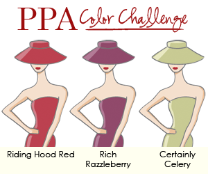
It’s Thursday and time to play at Pals Paper Arts! This week it is a Color Challenge, and as I stated in yesterday’s post, boy was it a challenge for me! It forced me to use a color, Riding Hood Red, that I have NEVER used. I had no idea what to do with this color combination of Riding Hood Red, Rich Razzleberry, and Certainly Celery, even though they look so pretty on the PPA “Painted Ladies”. I know when I look at the rest of the Design Team inspiration cards, I will say to myself, “Why didn’t I think of that?” My husband always critiques my cards, and his response to this one was…”Well, it’s not one of your best!” Bless his heart! I knew that, but had no time for a do-over! Don’t you just hate it when that happens?
 The Stampin’ Schach Design Tips:
- Ink and emboss! The Flourish image from the Bliss Sale-A-Bration set was inked with Rich Razzleberry and stamped onto Naturals Ivory card stock. It was then zipped through the Big Shot with the Square Lattice Textured Impressions Embossing Folder to add texture. A few spritzes with the Color Spritzer Tool and Rich Razzleberry and Soft Suede Stampin’ Write Markers complete the look.
- Distress! A Sponge Dauber and Soft Suede Ink are key tools for distressing! I also brayered Soft Suede over the tulip border to add interest.
- Mea culpa! Yes…that is Pear Pizzazz Seam Binding. But it “scrunchies” so well!
- Glitz and Glam! Basic Pearls form the center of the Riding Hood Red flowers, while Basic Rhinestones add bling to the butterfly!
Where Did I Go Wrong
When a good card goes bad, it always important to reflect upon why this occurred.
- Maybe the impending blizzard suppressed my mojo.
- Maybe the Twins distracted me.
- Maybe it was the caffeine from all of the home-made diet mochas I drank.
- Maybe it was because I waited too late to start.
- Maybe I allowed a negative mindset to sap my creativity. A positive attitude and success go hand in hand. Did I allow the fact that I am not a Riding Hood Red user influence how I felt about the combination?
- Maybe it was the fact I was stubborn. Instead of allowing the color combination to direct the stamp set which is used, I was determined to use the Bliss set, come what may.
- Maybe it was a combination of all of the above!
Please let me know what you think about today’s card by leaving a comment. Your comments are important to me, and I do read each and every one of them. And don’t forget, if you ever have a question about the cards that I create or the techniques that I use, I am only an email away. Until next time…
 Stamp Set: Bliss (W 121851, C 123217); Inks: Soft Suede (115657), Rich Razzleberry (115658), Riding Hood Red (111836); Stampin’ Write Markers: Certainly Celery (105106), Riding Hood Red (120971), Rich Razzleberry (120970); Card Stock: Naturals Ivory (101849), Riding Hood Red (111348), Certainly Celery (105125), Rich Razzleberry (115316); Tools: Big Shot (113439), Square Lattice Textured Impressions Embossing Folder (119976), Framed Tulips Textured Impressions Embossing Folder (121809), Sponge Daubers (102892), Color Spritzer Tool (107066), Brayer (102395), Scalloped Oval Punch (119856), 1-3/4″ x 7/8″ Oval Punch (119855); Glitz and Glam: Basic Pearls (119247), Basic Rhinestones (119246), Vintage Trinkets (118764), Pear Pizzazz Seam Binding (122330), Rich Razzleberry 5/8″ Satin Ribbon (119752)


Wow, this is over the top beautiful!
Love your creation!!
i think the card is beautiful, why else would i add it to my collection of card pics? it might not be your best but it sure is right there with the rest of them to me.
Oh Ann, I do like your card so much! I think you did great with your Riding Hood Red flowers! Nice use of texture too!
I think you knocked this challenge right out of the park. I would have gone nuts over this combo, but you did it proud. I love that your husband critiques your cards. And he seems to feel comfortable enough to be honest with what he feels. I love that! And I love your card! Best, Curt
Love all the little details. The cute little tweet, tweet so sweet.
xo, Marian
I find this card absolutely stunning. It is one of my top two favorite cards I have seen with this set.
Your card is beautiful but definitely out of my comfort zone too. Not so sure Riding Hood Red is the problem but combining it with Rich Razzleberry is the problem. However, your green ribbon adds pop. The color combo does nothing for me, but you were a great sport in working out of your zone. Don’t even think for a minute you lost your mojo, Ann!
It’s an interesting comment Ann “not one of your best.” On first thought, I might agree, because I believe you and I have the liberty to be totally honest with each other. However, I was stuck on it and had to wonder why. I kept looking and looking… Ann, I for the life of me can not figure out how you got the white/beige to be what it is. I read what you said and can STILL not figure it out…not because you didn’t explain it well but because I can not imagine it. You have achieved “a look” that is once again “so out of the box” that this, in itself, is outstanding! It isn’t often that I see a card that has me stuck on it and not knowing why…then finding out I still don’t understand the outstanding accomplishment of the creation. So, in summary – though OVERALL I hear Kim, the microcosm of this card is not only fascinating to me but I relish it as one of you OUTSTANDING creations. Way to go Ann…you, once again, have escaped that box I find you so famous for…forever creating something that in my mind is “uncreatable.” xox
Not one of your best?! I don’t agree. I like it.
You rocked it Ann! Another WOW card!
Great colour combo. Going out of your comfort zone has yielded a wonderful result. The Bliss stamp is very elegant too.
This is a very unusual color combo so it’s no surprise that it was difficult!! My goodness! I think the card you made is absolutely lovely; it’s a wonderful design layout, and I don’t blame you for wanting to use this fabulous new stamp set. For the very little that it’s worth, I think when the colors are not what we like we tend to not appreciate the creation, and I think this card is definitely worth appreciating…okay, if I were to give it to a friend, I’d ditch the green ribbon but everything else would stay LOL!!
another WOW from you Ann! I love how my eye is instantly drawn to the center of your card before picking up the rest of the lovely bits circling the flourish! Just lovely!
I love this card! It spoke volumes to me about how creative and eye catching it was. We can be our worst critics but you were too hard on yourself on this one. I think its just fab and I think I might CASE it! I hope that changes your mind about what you created!!! 🙂
I think you did an amazing job with that card. Lovely as usual!
Congrats to Wendy too!
Way to work those colors! You did an awesome job!
Hugs, M
Ann – I think your card is better than my best effort. I know this color challenge was a struggle (I’m still struggling with it myself). I’m glad your hubby gives you his opinion – better than mine who always says “nice” without looking at it. When I ask him 10 seconds later, what color was the card, he has to guess which annoys me. But he doesn’t complain when I order more SU products so that’s good. LOL
Don’t be hard on yourself – I like your card even if you don’t think it measures up to your expectations. It still has the “Ann Schach mark” with the textures and and visual appeal.
I actually really liked your card! In a million years I wouldn’t have paired rich razzleberry and riding hood red, but they looked great on your card. The bit of celery ribbon really set the whole thing off. I say, great job!
Okay, Mr. Schach and I need to have a little chat, this card is absolutely beautiful! Unless you used a few camera tricks to make us think differently. I love it and I’m glad you used the Bliss sentiment, it’s my favorite part of the card!
LOL I think it’s great that your husband can say that! My always looks at me with that look and will never say a word!!! I don’t know why I always ask his opinion!!! AND, I think your card is GREAT! I think anything you do is GREAT! 🙂
Love, Love, Love this card, Ann. It has such a beautiful vintage look that is so “in.” Like others have said, I think you are way too hard on yourself. Another beautiful creation on your part!
Ann, you are setting yourself to a very high standard! I think the card has many wonderful elements, that are very typically Ann. For me, when a card goes wrong.. .it’s usually that I have convinced myself I have to use a particular set and get driven by that. Or my mojo has gone walkabout for one reason or another!
hugs
jaydee
Ok, Ann, I have had time to discuss it with the SA chapter of your fan club and guess what? It gets a resounding two thumbs up! 🙂 Ha!
I think you did a great job with this one! I’m a bit stumped on this color combo myself…hmmm! I had a good laugh at your reflections, though. You are too tough on yourself! It’s really beautiful!
I think this looks good. It is a hard color combination to work with. I do believe that you are fond of the tulip embossing folder. I’m impressed with all the ways you’ve used it.
It’s a beautiful card, Ann! Nice color combination that I wouldn’t have thought to put together. I’m going to have to try doing that with the ribbon.
I don’t care what hubby says (Thank you so much for your support!) I think the card looks great! I think it has a very folksy look about it. Almost PA Dutch. Great job, Ann. YOU are your own worst critic!
Mike
I agree with the others! You pulled this color combo off with flying colors! Really, the colors all pop and yet flow so nicely! Love it!
Ann, you did it again. This is amazing and absolutely beautiful. I love the colors, and your work is so awesome!!! Thank you for sharing!!!
Give the pups hugs and licks for me.
LOL -I must be different because I really like your card -I believe all the texture gives it the “wow” and I really like the color combination !
I agree with Nikki, what are you frettin’ about? I think you pulled it off fabulously! I love the seam binding more and more! Anyway if your mojo is cold come visit me it is 76 today or you could spice up your mochas!!
Ann, I don’t think you went wrong with your card at all, just the opposite! I like that way you added just a touch of celery, and lots of texture.
I don’t know whatyou are fretting about!…I love it! I agree…riding hood red and razzleberry is an usual duo but you did it brilliantly! …and GASP…you don’t use riding hood red?!?! It is one of my favs!…although cherry cobbler has been my go to red lately.
{SMILES}
I like how the Certainly Celery is an accent. You did a great job, Ann!
I don’t know about your hubby, but I think it’s FABULOUS! And I love your posts! They are always so insightful! Thank you for sharing a little bit of you with us.
I do like RHR & RR, but I would never have thought to put them together! Even though you (& Kim) don’t think so, you did create a lovely card. Perhaps you will even be pulling out RHR more often now 🙂
I like your card, and I know how you feel about odd color combos, sometimes we over think them. Saying that sometimes when I think my card is great my children and grandchildren walk by and say what were you thinking, or I don’t like that. So family we gotta love them.
Ann, it’s not bad at all! I was bracing myself for a feeling like your husband had but NO! It is still very beautiful, and very much an “Ann Schach” card.
I think it is a terrific card! The textured background with the flourish is marvelous. Again I think it is great. First one I was drawn to.
Hi Ann. I have to agree with most of the comments that I’ve read. I think you’re being too hard on yourself. It’s a beautiful card!! I have a suggestion for you…..try again….adding more of a neutral….or try using more green than Riding hood red since it’s your least favorite color. I would LOVE to see this same card, same colors, but shaken up a little. I’m going to try the color combo to see what I can come up with. Relax….you’re still an awesome stamper and we (all your faithful readers) LOVE what you share with us! Thanks for all you do! Many Blessings, Tana Conley
http://tanaconley.blogspot.com
Your card came out beautifully!!!! It was our of your comfort zone but WOW! It’s sooooo vintage!
Ann I think your card (all of them) is just beautiful. You are WAY to hard on yourself too, as I’m sure others will say. You never disappoint us with new ideas and inspiration.
I’m soooooooooo excited because my SAB box should be on my porch TODAY!
Can’t wait to play along.
Even out of your comfort zone you created a great card. This color combo would be hard for me also. I love getting my husband’s opinion but because he’s color blind, I always take that into consideration when I don’t “agree” with his reaction to my project.
Your card turned out great! I am not a fan of this color combo, but I do love Riding Hood Red! I was so excited when SU said it would be a new core color. Thanks for sharing!
The DT did amazing with the color combo – I still have a furrowed brow and quizzical look! I LOVE your where did I go wrong – many times I do the same and am completely stuck on a set and I better just make it work! Don’t be so hard on yourself Miss Ann, it is still another amazing ann card~ 🙂 HUGS
I have to say it would have been a challenge for me to match the red and the razzleberry, BUT you did it wonderfully. I really like the card alot and think the colors work well together. Although I totally know how it is to look at your work and wonder if you got it just righ, don’t be so hard on yourself because you did a fab job.
Love the Bliss stamps and all of the extra touches you always put on your cards to give them that special look.
Ann, you did great with the colour combination and sometimes we don’t know why our creations go askew. The colours are difficult to put together, but you tried and that is what a challenge is all about.
That was a difficult color combination. Love the green scrunched ribbon and your attitude!
Another beautiful card! That is a difficult color combination, but you did a great job! If only my “bad” cards looked this good!
With so much perfection on a card I’m troubled you don’t like it very much.
Oh you pulled it out – and with just the right amount of Pizzazz! The green gave it just the right amount of pop -I think it turned out great! (And Carla’s comment just made me laugh!)
Ann your card is beautiful as always. Soon as I seen it, I said Oh!!! pretty…. To be honest I have never used riding hood red yet either. It is not one of my favorite colors, it is never the right shade for what I want. So I can see why maybe you struggled to use it.. But the thing is you still made a beautiful card even if it’s not one of your favorites. But I know anyone would be happy to recieve it.
hugs
Darlene-Joy
I love it!!! Hubby’s and Mom’s aren’t always thinking correctly… they must have too much on their minds and we shouldn’t have interrupted that. I love your details and the white textured panel. Hugs,
No offense to your husband (and to you evidently) but WHAT??? As soon as I saw this card I thought “wow, how does she outdo herself with every creation”? I think this is a lovely card so you may be on track with the snow theory. Only, it didn’t zap your mojo, just clouded your vision, ha ha!
I love this card. Can’t find anythng wrong with it–it’s a wow card. Makes we wish I’d opted for that set when I picked my SAB stuff. Great job.
I don’t think that you should be so hard on yourself. I think that you did a great job with the color combo and layout. I went to look at the others and must say that I like yours and Carla’s the best. You always put a good amount of details and combinations of texture and 3-D. I wouldn’t have ever thought of that color combo but now I might try it since you two made it look so nice. Thanks!
My first reaction to your card was, “WOW, I like this card!” I believe getting out of our comfort zone leads us to new creativity, consider it a learning experience. I used a quote when I went back to college to get my teaching degree and masters to get me through the rough times – “To risk is to grow”. It worked!
Bottom line, if I hadn’t read your comment, I would have never known this was difficult for you!
Keep up the inspiration for the rest of us!
The color combo was a challenge but you did it!! Your card is very charming. I love this stamp set. I can see why you were drawn to using it!
My husband is my best critic too. I can trust him to give an honest answer even if it’s not what I want to hear…lol.
I really like the card….I know it’s not your regular color comfort zone but I think any color combo works well with this set. I’m using this set for a website I am designing for and my color combo is early espresso, crumb cake, so saffron and GARDEN GREEN…it’s been interesting…I will be posting the cards soon…LOVE YOUR WORK!!!