


It’s Sunday and time for The Paper Players Challenge. This is a color challenge week, and Design Team member Nance Leedy has selected this beautiful color combination for you.

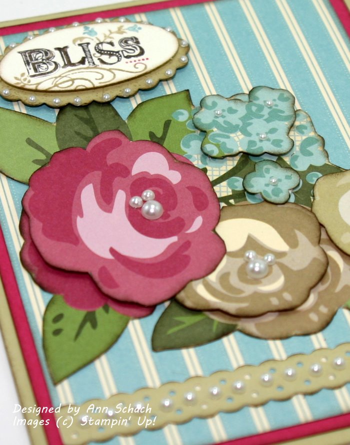
Instead of focusing on stamping, my card features the beautiful Springtime Vintage Designer Series Paper…my new found favorite! The sentiment is from the Bliss Sale-A-Bration set. Don’t you just love it? Enjoy today’s quick and easy card!
The Stampin’ Schach Design Tips:
- Big blossoms! Worried that larger patterns on designer paper will overpower your card? Let them become the star of the show! I snipped out these beautiful blossoms from Springtime Vintage and adhered them to coordinating stripes from the Elegant Soiree collection. The result reminds of 1940’s pajamas!
- Add depth and dimension! Additional blossoms were paper snipped and popped up on Stampin’ Dimensionals for a three-dimensional effect!

- Bliss! Early Espresso, River Rock, Rose Red and Baja Breeze Stampin’ Write Markers were used to ink this beautiful image from the Bliss stamp set.
- Slightly distressed! The edges of all layers were very softly distressed with Soft Suede ink to give them a finished look.
- Finish in fashion! Basic Pearls surround the sentiment, adorn the Dotted Ribbon Scallop border, and form the centers of the flowers.
Sometimes it is fun to let the paper take center stage on a card, such as we see today. It’s quick and easy! And you do not have to use this many pearls. I wanted to show you several options so that you could see what the mini-pearls look like on the Scallop Oval and how the Dotted Ribbon border looks adorned with pearls. For another great look…try cross-stitching the border!
I hope that you will head over to The Paper Players and check out what my Design Team colleagues have created for you! I will give you a little hint…it’s all fabulous! But before you leave, won’t you please leave me a comment and let me know what you think of today’s card? You comments definitely brighten up my day. And remember, if you have any questions about the cards that I create or the techniques that I use, I am only an email away! Until next time…

 Click Here to Order Stampin’ Up! 24/7
Stamp Set: Bliss (W 121851; C 123217—Sale-A-Bration); Inks: Soft Suede (115657); Stampin’ Write Markers: Baja Breeze (120965), Early Espresso (119680), River Rock (120972), Rose Red (100063); Designer Series Paper: Springtime Vintage (121782—Occasions Mini), Elegant Soiree (117163); Card Stock: River Rock (108640), Rose Red (102544), Very Vanilla (101650); Tools: Paper Snips (103579), Sponge Dauber (102892), 1-3/4″ x 7/8″ Oval Punch (119855), Scallop Oval Punch (119856), Dotted Ribbon Border Punch (119275), Stampin’ Dimensionals (104430); Glitz and Glam: Basic Pearls (119247)


Ann. fabulous job cutting out the flowers. This really is a perfect vintage feel card.
hugs
jaydee
Thanks for some quality points there. I am kind of new to online , so I printed this off to put in my file, any better way to go about keeping track of it then printing?
Oh Ann (I say that alot!) I love how you’ve layered the DSP flowers here and given them so much dimension. Beautiful use of the PP colors my friend!
Very creative use of DSP!
Love the pearl accents.
Hugs, M
I love this card!! Just beautiful and rich and so detailed. Love the way you layered the colors. Hugs,
Lovely Ann, this paper looks great taking center stage!
LOVin’ the 3-d popped up look!
This is gorgeous Ann! I’ve never tried to used my DSP as the main focal point….the way that you have! I love it. {SMILES}
I agree with all of the others- gorgeous flowers that steal the show! Love the use of the stripes and of course, the pearls! Glad to hear that Miss Muffy is on the mend and being a great patient!
What a gorgeous card…love the idea of cutting out the flowers….your cards are so inspiring!!!! Thanks!!!!
Love what you did with the pretty new DSP. And those pearls–perfect!
Nice combination of all your elements. Love the many pearls.
Lovely card Ann. You have really showcased the DSP. Isn’t it amazing what you can do without stamps and ink? Your card reminds me of wall paper that my grandmother used to have in her living room
Gorgeous—-and you were worried? Look at all those comments! Your flowers are the star of the show!
Love this Ann. The DSP is so gorgeous, I has no idea! This card feels like it should go to someone you are having tea with! Shabby Chic at its very best!!
Hugs!
Lesley
Your card is so beautiful. I really like the color combo. The dsp with the large images is always my most difficult to use. Cutting out the image and using as a focus on a card is a terrific and easy solution. Thanks for your ideas.
Great card! I love to read everyone’s comments too! I looked back at a card I had done something similar with and I think if I had softened the edges it would have made a better card. Also, the pearls would have been a nice touch but I made the card a couple years ago BP (before pearls). Whatever, I think my step-mother-in-law still liked it. I agree about the card reminding me of those vintage tablecloths or even a hanky. Ann, have you ever seen Bev Siekman’s collection of hankys?
Thanks for sharing a “new” technique with us and a really fun card!
Chris R. from Iowa
What a beautiful card, Ann! This is a perfect way to use some of the papers that are more suitable for a scrapbook page on a card. Thanks for blessing us with your talent and creativity. Although I don’t get a chance to comment on all of your posts, I do look forward to receiving your blog every day ~Bonnie~
Ann what a pretty card. I have cut out designs before, but your tip of edging them with marker is great. It really DOES make them stand out. Love those pearls of course on both the flower centers and ribbon trim. Wow.
TFS
Just love what you did with this card. I think we need to order everything we want out of the Main Catalog before all the mini’s come out. It seems like I never get back to the Main Catty. lol. Just so many nice things in the mini’s!!! Ann, you show us how to get that little extra out of our goodies. Thanks
Yvonne
Yvonne
so pretty, love the color combination she picked, and your vintage design.
This is a great card and I love the way you used the paper flowers and it fits right in to my “let’s put pearls on anything that doesn’t move” mood! Thanks for blessing my day. 🙂
I like how you fussy-cut those flowers and popped them up, Ann. I need to order some of that paper; it’s on my list of Things I Want! Just waiting for SAB to go live….
I love this paper too! And the fav stamp set. But what you manage to do with each, separately and together is stellar. I am loving your use of pearls on your cards Ann. They are so unusual and highlight in ways that are awesome. The layering is very cool and offsetting! Can not wait for the 25th as a new consultant to place that fantastic offer from SU! Pretty unreal that such a gorgeous mini comes out just in time….oh how brilliant a company you trailblaze for!!!!!
I never think to use paper as my focal point. This card is amazing with awesome details!
Very beautiful!!! I love the layers of flowers it all looks so vintage.. It reminds me of wallpaper I had on my walls when I was a little girl. I had two walls striped and two that were flowers.. lol
hugs
Darlene-Joy
Fabulous!! I love how you cut out the flowers and layered them and the pearls really finish it off nicely! I think you can never have too many pearls!! It does look like pajamas but I thought it looked like one of those beautiful vintage table cloths too.
Lorraine Castellon-Rowe